Jean Widmer and the Public Life of Design
Jean Widmer, who died earlier this year at 96, leaves behind work that became part of everyday life in France. The Swiss-born, Paris-based designer shaped some of the country’s clearest visual markers, from the Centre Pompidou logo to motorway and tourist signage. What made his work last was not only its elegance, but its function. He treated design as a public language that had to be understood quickly, remembered easily, and stay strong over time.
Trained in Zurich under Johannes Itten, Widmer arrived in Paris in the 1950s and brought with him the rigor of the Swiss school. He worked first in advertising, then at Galeries Lafayette, and later at Jardin des Modes, where he explored the relationship between photography and typography before moving toward a more reduced and structural approach. That shift explains why his later work never felt ornamental. Even when he worked in fashion or for cultural institutions, he was looking for order, rhythm, and legibility.
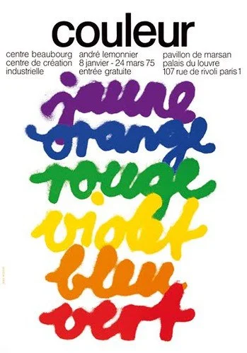
One of the clearest examples is his work for the Centre de Création Industrielle, beginning in 1969. For the CCI, Widmer built a poster system from a twelve-square modular grid and used it to create 21 exhibition posters. He fixed the text in the top section and let basic forms, bold color, and simple geometry carry the idea below. The result gave design a serious cultural presence in France and helped redefine the visual language of institutional graphics for the decades that followed.
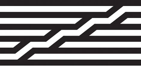
His most famous work came a few years later with the Centre Pompidou. Widmer sketched the logo while sitting across from the construction site, reducing the building to horizontal bands and the diagonal movement of the escalator. That act of reduction says a lot about how he worked. He was not interested in adding more. He wanted to find the one form that could hold the idea. The same mindset shaped his wider work for institutions such as the Musée d’Orsay, the Institut du Monde Arabe, the Jeu de Paume, and the Bibliothèque nationale de France.
Just as important was his work on French road and tourist signs. Widmer understood that signage affects attention, stress, and behavior, so clarity was never a detail. His brown autoroute pictograms and his studies of type spacing, lowercase letters, visibility, and movement helped make public information easier to read at speed and easier to follow. That may be the best way to remember him. Jean Widmer showed that design is not decoration placed on top of life. It is a structure that helps people move through it.